A short history of color theory
Of all the subjects presented in this book, this part devoted to color theory might be the most perplexing one. Although a basic understanding of the color spectrum is rather easy to develop, color theory is an almost infinitely complex subject with roots in both science and art. It can therefore be a daunting task to learn about color composition in a way that is true to both art history and scientific truth, and I have seen many designers stumbling on the most basic of questions: Is yellow a primary color? Which color combinations are harmonic? What is the true complementary color to blue?
I hope that this chapter on the history of color theory can help answer some of these questions by highlighting both the mistakes and successes of key figures in the field. In this abbreviated and narrow introduction, I am especially interested in the conflict between the two distinct but related fields that both operate under the term ‘color theory’: Artistic color theory, which is concerned with the visual effects of color combination in the fine arts, and scientific color theory, which describes the nature of color through increasingly complex but precise color models. The following chapters will build on lessons learned in this chapter, and it is my belief that it is essential for designers to develop a solid understanding of this history in order to make good decisions about color.
One of the first known theories about color can be found in On Colors, a short text written in ancient Greece. The text was originally attributed to Aristotle, but it is now widely accepted to have been written by members of his Peripatetic school. Based on observations of how color behaves in nature, the text argues that all colors exist in a spectrum between darkness and light, and that four primary colors come from the four elements: fire, air, water, and earth. This can seem rather weird and speculative today, but these observations made sense at the time: A plant is green above ground and white in its roots, thus the color must come from the sun. Likewise, a plant left to dry will lose its vivid colors, thus water provides color too. This theory is typical of how color theorists for centuries used color to establish a general theory of the universe. Despite the erroneous theory, On Colors has a series of important observations, like the fact that “darkness is not a colour at all, but is merely an absence of light”1 – a discovery propelled by watching how clouds darken as they thicken2.
Like so many other areas of science, Isaac Newton completely redefined the conventional theories on the behavior of light when he published the first edition of Opticks in 1704. Rather than seeing light as a void of color, Newton discovered that white light is a combination of all colors across the color spectrum. The basics of his experiments was a well-known phenomena: When you shine white light through a prism, the light is split into colors from across the color spectrum. However, Newton discovered that he could recombine these spectral colors to once again turn them into white light.
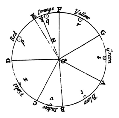
Newton also discovered that if he blended the first color (red) and last color (violet) of the color spectrum, he could produce magenta, an extra-spectral color that does not exist in the rainbow. This prompted him to wrap the color spectrum into a circle, beginning a tradition of using basic shapes to represent the relationship between colors. Newton used a circle because it could be used to predict the result of color mixing for two colors by pointing to the color midway between these colors. The colors on Newton’s circle have asymmetric distances to each other because Newton wanted the circle to have seven colors – the exact number of days in a week and musical notes in an octave3.
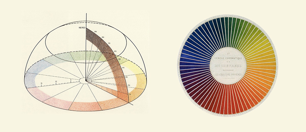
While Newton was interested in a scientific explanation of color, the German poet Wolfgang von Goethe dedicated his book Theory of Colors from 1810 to a more human-centered analysis of the perception of color. Through a series of experiments that measured the eye’s response to certain colors, Goethe created what is arguably the most famous color circle of all time. The circle had three primary colors – magenta, yellow, and blue – which he believed could mix all other colors in the spectrum.
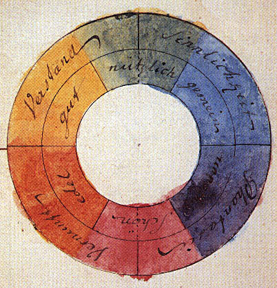
This publication was in many ways at odds with Newton’s theories, as Goethe believed that the prism, not the light, was responsible for the creation of color, and that darkness was not an absence of light. Although Newton eventually won the argument about the nature of light, Goethe’s work is important to us because it focuses on the cognitive effect that color has on humans. His research on the effects of after-images and optical illusions is especially interesting, because it points towards the later works of Johannes Itten and Josef Albers4.
Even though Newton's and Goethe’s color circles may seem to be at odds with each other, they are in some way both correct as they illustrate the behavior of color in different material. Newton describes how his spectral colors can mix most visible colors including white, and this is true because light mixes in an additive way: Combining lights of different colors will eventually result in white light. Goethe describes how his three primary colors can mix most visible colors including black, and this is true because pigments mix in a subtractive way: Combining paints of different colors will eventually result in black paint by subtracting waves of light.


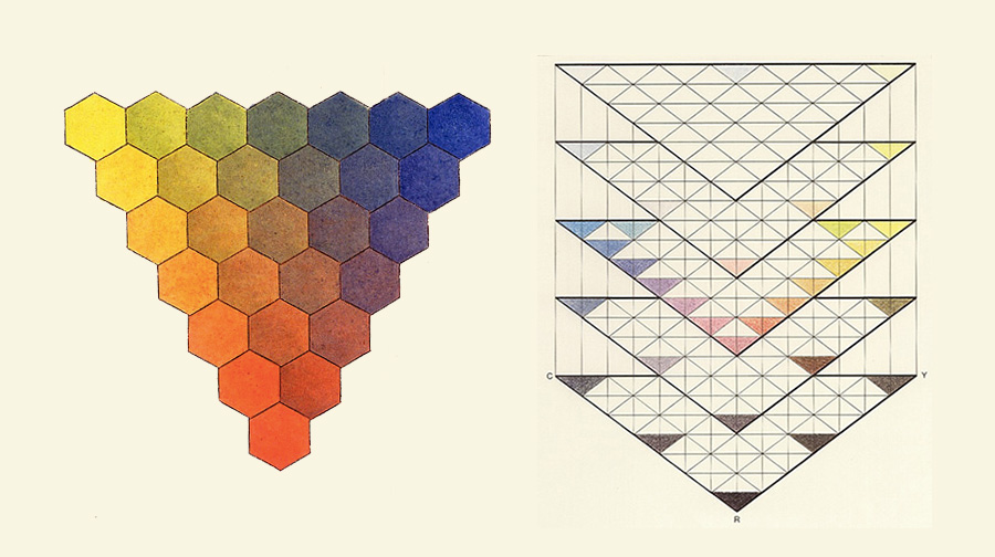
In a quest to create a unified notation for color – like we know it from musical notation – artists soon started depicting the color spectrum as 3D solids. A concurrent example of this can be found in Tobias Mayer’s color triangle from his book The Affinity of Color Commentary, published posthumously in 1775. Mayer sought to accurately define the number of individual colors the human eye can see, and this required him to add another dimension to represent the variations of brightness for each color. Mayer painted the corners of a triangle with the three traditional primary colors from painting – red, yellow, and blue – and connected the corners by mixing the opposing colors together. Unlike the traditional color circle, he created many variations of this triangle by stacking triangles of different brightnesses on top of each other. This made it possible to define a color by its position within a 3D space, a technique still used to this day. Mayer ultimately failed at creating a color model with perceptually uniform steps, as he did not understand the irregularities of the human eye5.
The German painter Philipp Otto Runge took this same approach when creating his spherical representation of the color spectrum, published in his Color Sphere manuscript in 1810. Runge’s sphere had white and black poles with colored bands running between them. However, like many other representations of color before it, the model did not differentiate between brightness and saturation, which meant that the resulting model had little variation in color intensity. This sphere had the same problem as Mayer’s triangle, as the steps were not perceptually uniform6.
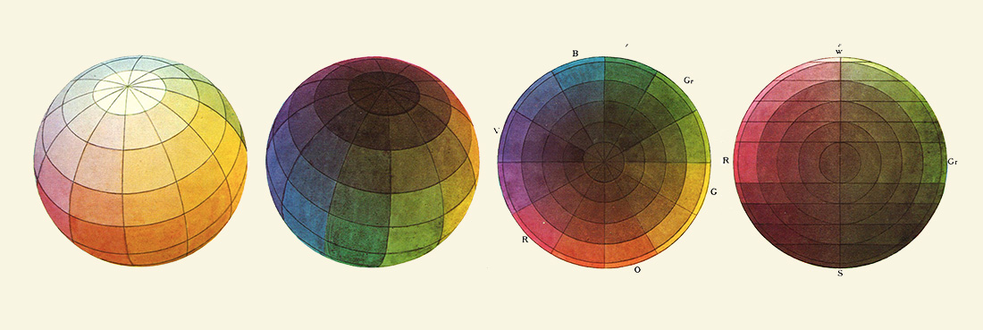
Michel Eugène Chevreul attempted to fix this problem in his hemispherical color system from 1839. Rather than mixing colors by focusing on the amount of paint used, he based his selections solely on what perceptually appeared to be the correct mixture. Inspired by the work of Goethe, Chevreul used after-images to test the validity of his mixtures. When a person stares at a green square for a long time and then looks at a white wall, a magenta square will appear. This happens because of fatigue in the green photoreceptors in the eye, and Chevreul used this to establish the complementary colors in his model7.
One of the most historically significant color solids was created by the American painter Albert Henry Munsell in the early 1900’s. Like his peers before him, Munsell wanted to create a model with perceptually uniform steps, and although he was a painter, his approach was very scientific: He used human test subjects and a range of mechanical instruments he invented to create a remarkably accurate model. One important detail about Munsell’s color system is that he divided the color space into three new dimensions: The hue determined the type of color (red, blue, etc), the value determined the brightness of the color (light or dark), and the chroma determined the saturation of the color (the purity of the color). These dimensions are still used to this day in some representations of the RGB color model.
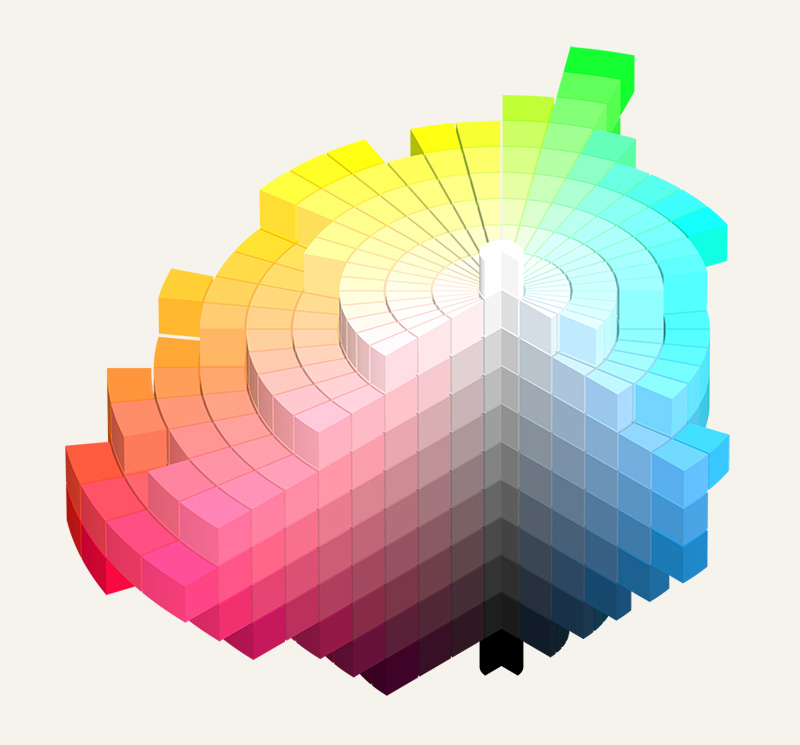
Munsell first tried to arrange his colors in a sphere, but noted that “the desire to fit a chosen contour, such as the pyramid, cone, or cube, coupled with a lack of proper tests, has led to many distorted statements of colour relations”8. Essentially, Munsell realized that his color solid had to have an irregular shape to fit his colors. The explanation for this is rather simple. Colors with low brightness have much fewer visible colors between zero and full saturation (colors with zero brightness only have one, black). Likewise, some hues have more range than others. You can mix more visible colors between red and white than between yellow and white, because yellow is a lighter color. Another important detail of Munsell’s color system is that he prefered the use of a mathematical syntax over color names to indicate a color’s position within the color space. This is not unlike how we define colors in programming languages today. Munsell’s color system had its flaws and inconsistencies, but it managed to bridge art and science in a way not done before, and it still forms the basis of the curriculum at many fine art institutions.
Many of the European art movements in the early 20th century had a profound interest in the subjective experience of art, and although the Bauhaus school in Germany was a school focused on a modern approach to art, design, and architecture, two important publications on color and perception were written by Bauhaus faculty: The Art of Color by Johannes Itten9 and Interaction of Color by Josef Albers10.
As a follower of the Mazdaznan religion, Itten’s view of the arts was highly influenced by his spiritual beliefs. Following a strict vegetarian diet, he was famous for performing rhythmic breathing exercises with his students in order to have them realize their full creative potential11. In his mind – like Goethe’s – it was the subjective experience of color that mattered, and his book focuses on how color can be combined to invoke feelings in the viewer. The central idea in Itten’s work is the existence of seven color contrasts that artists must master in order to know the effect of their color choices. Some of these contrasts are simple, like the contrast of light and dark that exists when colors of different brightnesses appear next to each other, or the contrast of hue that can be seen when colors of different hues are used together12. These observations can still be used by aspiring designers to guide decisions around color, as they give us a way to classify color and think systematically about their use. Itten even operated with a RYB color sphere remarkably similar to that of Runge to help explain these ideas. Other of Itten’s contrasts can seem rather arbitrary, like his law of simultaneous contrast that states how certain colors create visual effects when used together. Itten often uses his own subjective experience to establish a generalized theory on color and perception, as demonstrated in the quote below.
“For the solution of many problems, however, there are objective considerations that outweigh subjective preferences. Thus a meat market may be decorated in light green and blue-green tones, so that the various meats will appear fresher and redder. [...] If a commercial artist were to design a package for coffee bearing yellow and white stripes, or one with blue polka-dots for spaghetti, he would be wrong because these form and color features are in conflict with the theme.”
Johannes Itten13
Here, Itten’s personal preferences towards the color palette bleed into an unnecessarily strict generalization about color and subject. Who is to say that yellow stripes or blue polka-dots cannot be used effectively when designing food product labeling?
Josef Albers, a student of Itten’s at the Bauhaus, took a more demonstrative approach in his Interaction of Color from 1963. Using opaque pieces of colored paper, Albers sets out to show the highly dynamic nature of color, particularly how humans tend to perceive a color based on the colors around it. Rather than trying to establish some unified theory about why color behaves this way, Albers describes how students can repeat these experiments to experience it on their own. This has made The Interaction of Color one of the most important and timeproof books on color composition. Pictured below is one of his most famous examples with two small squares on colored backgrounds. The viewer naturally assumes that the squares are filled with colors from the opposite backgrounds, when they in reality are the exact same color.
As illustrated above, our art history is full of arguments over the nature of primary colors, which is in part caused by the confusion over subtractive and additive color models. It is notoriously hard to mix yellow from darker paints, which is why Goethe and other artists thought of yellow as a ‘pure’ color with qualities different from the rest of the color spectrum. We know today that the concept of primary colors is actually a rather arbitrary one, and there is no such thing as ‘pure’ primary colors for pigments. One can choose any three colors to mix a subset of the spectrum, and although some primaries can mix a wider range of colors, it is impossible to mix the entire visible color spectrum in a subtractive color model.
“The conclusion [...] is that primary colors are only useful fictions. They are either imaginary variables adopted by mathematical models of color vision, or they are imperfect but economical compromises adopted for specific color mixing purposes with lights, paints, dyes or inks.”
Bruce MacEvoy14
These discoveries are deeply integrated into the devices that we all use on a daily basis. The industry standard for desktop printers and other pigment-based printing mechanisms with subtractive color mixing is to have three colors based on the CMY color model: cyan, magenta, and yellow. It is now well understood that this particular set of colors can mix an acceptable range of colors in ink. Printers also have a black ink because these primary colors cannot mix to a true black, and it has the added advantage of saving costly colored ink. However, professional printers can have many more ink cartridges for better color accuracy. Epson, a leader in digital printing technologies, uses ten ink colors in their UltraChrome® HDR technology.
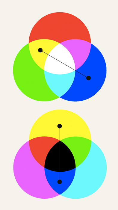
The industry standard for computer screens and other light-based display technologies with additive color mixing is to have three primaries per pixel based on the RGB color model: red, green, and blue. These three colors mix to an acceptable range of the visible color spectrum, where the exact amount is decided by the quality of the monitor, but also the computer’s graphics card. Any digital design tool today will allow designers to define colors based on a combination of these three primaries. A special bonus of the RGB and CMY color models is that even though they have different primary colors, they share complementary colors.
Just like there is common agreement on the scientific nature of color today, it is also known that the human experience of color is a highly complex and subjective phenomenon. It is generally accepted that it is impossible to create a simple, predictive theory about color harmony – the type of approach that Goethe and Itten believed in. A number of factors determine your response to a specific combination of colors, including gender, age, mood, personal background, and current trends in society15. In some sense, this should be a relief to aspiring designers. For one, it relieves them from participating in irrelevant discussions about which color circle has the ‘correct’ complementary colors. Also, without a simple algorithm to find harmonic colors, the student has no choice but to use their own eyes.
When reading this account of artists and scientists who dedicated their professional lives to the creation of models that help other artists make educated decisions about color composition, it should be clear that the way designers today interact with color – the color picker – leaves much to be desired. The color picker is as omnipresent as it is broken: With no significant changes over the last decade, it fails to provide a meaningful visual representation of the color spectrum, even though such models has existed for more than 300 years. Instead, it uses a rectangular area to show a single hue at a time, and designers are left with no way to visualize the relationship between the selected colors, or even understand the difference between a perceptually uniform color model and its counterpart. The consequence is that this entire history of color theory is neglected in modern design tools, which means that it is lost on students too.
Luckily, we are not bound to digital design tools in this book. In the following chapters, we will examine color models, color spaces, and many techniques that can be used to generate color schemes in code. In order to not make the same mistakes as the people before us, these chapters will not seek to propose a unified theory about which colors are best for certain scenarios. Instead, we will get to know the color palette, and learn how to see the effects of different color combinations. This will hopefully lead to students developing a sound theoretical foundation upon which to base their practice.
- Loeb Classical Library (1936) Aristotle’s Minor Works, p. 7. London
- Gottschalk, H. B. (1964) The De Coloribus and Its Author, p. 59-85. Hermes 92. Bd..H. 1: JSTOR. Web. 11 Jan. 2017
- Ball, Philip (2003) Bright Earth: Art and the Invention of Color, p. 25. University of Chicago Press
- Sloane, Patricia (1967) Colour: Basic Principles New Directions, p. 28-30. Studio Vista
- Lowengard, Sarah (2006) The Creation of Color in Eighteenth-Century Europe New York, para. 129-139, Columbia University Press)
- Ball, Philip (2003) Bright Earth: Art and the Invention of Color, p. 48. University of Chicago Press
- Ball, Philip (2003) Bright Earth: Art and the Invention of Color, p. 175-176. University of Chicago Press
- Munsell, A.H (1912) A Pigment Color System and Notation, pp. 239. The American Journal of Psychology. Vol. 23. University of Illinois Press
- Itten, Johannes (1973) The Art of Color: the subjective experience and objective rationale of color. Van Nostrand Reinhold
- Albers, Josef (1963) Interaction of Color. Yale University
- Droste, Magdalena (2002) Bauhaus, p. 25. Taschen
- Itten, Johannes (1970) The Elements of Color, p. 33-44. Van Nostrand Reinhold
- Itten, Johannes (1970) The Elements of Color, p. 26. Van Nostrand Reinhold
- MacEvoy, Bruce. Color Vision Handprint : Colormaking Attributes. N.p., 1 Aug. 2015. Web. 11 Jan. 2017.
- O'Connor, Zena (2010) Color Harmony Revisited, p. 267-273. Color Research and Application. Volume 35, Issue 4