Geometric composition
“By making visual categories explicit, by extracting underlying principles, and by showing structural relations at work, [the aim is] not to replace spontaneous intuition but to sharpen it, to shore it up, and to make its elements communicable.”
Rudolf Arnheim1
In the late 1800’s, psychologists in Germany performed a range of studies that would later form the foundation of Gestalt psychology. This new branch of psychology stated that humans, because we live in a complex world, seek to derive fast, simplified conclusions about what we see. The first thing most people see when presented with the drawing below is not 51 circles, but rather the groups these circles form based on their distance to each other and other visual similarity: A rectangle and a triangle. Observing how humans naturally try to turn a complex world into simple, actionable insights, the German psychologist Kurt Koffka would famously state that “the whole is something else than the sum of its parts” 2.

Because this branch of psychology is devoted to the mechanisms of perception, and since it emerged in Germany at the same time of the Bauhaus school, the Gestalt principles have long been used by artists and designers to anticipate the effects of their work. This is not a chapter on psychology, but Gestalt theory teaches us an important lesson about graphic design: Users of your design will naturally draw conclusions based on the entirety of your design, and if you do not formalize the content into a coherent layout, you are not in control of how the design is perceived. In other words, your entire design is a shape in itself, and that shape has to be designed too.
Those who are just beginning their design career might think that the ability to create clean and organized layouts is something that automatically comes with experience. Although practice does make perfect, it is remarkably hard to consistently arrange shapes on a page without a basic system to guide the decisions. Luckily, there is a technique that even the most gifted designers use to organize their layouts, achieve a balance between the shapes used, and spark new ideas whenever creativity falls short. This chapter focuses on an important layout technique in graphic design often referred to as geometric composition, which entails dividing the canvas into smaller parts and using these divisions to arrange the visual elements. This technique can be used to create endless organized and expressive designs, and it happens to be a great technique for those of us using code in the design process.
Canvas Division
To demonstrate what geometric composition looks like in practice, let us imagine we are asked to design a poster for an upcoming photographic exhibition, and that the client wants this poster to hold exactly three important photos from the exhibition. In our first attempt at designing such a poster, we will position and scale the images to each take up one third of the canvas. Although this might not be the most thrilling layout, it guarantees that each image has an equal amount of space and that the horizontal lines created between the bordering images are evenly distributed from top to bottom. This is demonstrated in the code below where we are using three rectangles with different colored fills () instead of images in order to not worry about image cropping. Notice how the height of each image is set to be exactly one-third of the canvas height, and how the y positions of the images are based on this value too.
Many designers use this Rule of Thirds in situations where centering a shape is considered too dull or static. Some will even argue that placing important shapes around the thirds of the canvas will increase the dynamism and aesthetics of the design. Putting the validity of that discussion aside, we have already achieved something that would be hard to do without a layout system: Positioning and scaling three images evenly across a canvas. However, the result appears somewhat dense because there is no whitespace between the images. To make up for this, we can introduce margins (a term used to describe empty space around content) between our images to make the design more airy. The attentive reader will notice that the math required for calculating the height of each image is now a bit more complex. First, we have to find the size of the margin, which we calculate based on the canvas height in order to make our layout responsive in case we ever resize the canvas.
const margin = height / 20;
We then calculate the combined height of all three images, which is the canvas height without our margins. Note that since we are only adding the margin between the images, there are only two margins for three images.
const allHeight = height - 2 * margin;
Finally, we divide the allHeight variable by the number of images, which gives us the height of a single image. This value will also be used with the margin variable to calculate the position of each image.
const imgHeight = allHeight / 3;
The full code example below uses these variables to place each image at the correct position. By changing the value of the margin variable, we can easily increase or decrease the amount of whitespace, or even use the random() function to randomize the margin every time the code runs.
const margin = height / 20;
const allHeight = height - 2 * margin;
const imgHeight = allHeight / 3;

background(240);
noStroke();

fill(75, 185, 165);
rect(0, 0, width, imgHeight);

fill(120, 155, 155);
rect(0, imgHeight + margin, width, imgHeight);

fill(30, 50, 50);
rect(0, 2 * (imgHeight + margin), width, imgHeight);
We can continue our quest to add more whitespace by introducing margins around the edges of the canvas as well. Like a framed painting, this will remove the denseness of the layout even more, and call attention to each image as a separate piece of content. It will also allow us to add captions underneath each photo if necessary. We use the same code from above to calculate the height of each image, adding two extra margins for the top and bottom. We also use the same type of calculation for a new imgWidth variable to find the width of each image.
const margin = height / 20;
const imgWidth = width - 2 * margin;
const allHeight = height - 4 * margin;
const imgHeight = allHeight / 3;

background(240);
noStroke();
fill(30);

fill(75, 185, 165);
rect(margin, margin, imgWidth, imgHeight);

fill(120, 155, 155);
rect(margin, margin + imgHeight + margin, imgWidth, imgHeight);

fill(30, 50, 50);
rect(margin, margin + 2 * (imgHeight + margin), imgWidth, imgHeight);
You might notice how the calculations are becoming longer the further down the page we go. This is because each image has to find its y position based on the number of images that came before it. There are always multiple ways of achieving the same outcome when writing code, and since some designers will find long calculations hard to read, let us instead rewrite the same example using the translate() function.
As described in earlier chapters, the translate() function can be used to move the canvas itself. If you draw a rectangle with rect(0, 0, 50, 50), a square will normally appear in the top left corner of the canvas. However, if you write translate(100, 100) in the code before drawing the rectangle, the square will now appear 100 pixels down and 100 pixels to the right because of the translation. You might think of this like what happens when you click and drag on Google Maps: All shapes stay in the same positions within the canvas, but the canvas itself is being moved around. One powerful (and challenging) aspect of translations is that they are cumulative, which means that they are added on top of previous translations. This is best demonstrated with a quick example. Notice how the second translation is added on top of the previous one, making the rectangles show up below each other despite having the same x and y values.
background(240);
noStroke();
fill(30);

translate(175, 100);
rect(0, 0, 150, 130);

translate(0, 175);
rect(0, 0, 150, 130);
We can therefore use the translate() function before drawing an image to move the canvas down to the correct position. We no longer need the long calculations for the last images, since the translations are added on top of each other as we go along. Note that we are adding a few more lines of code, but that is the compromise we have to make.
const margin = height / 20;
const imgWidth = width - 2 * margin;
const allHeight = height - 4 * margin;
const imgHeight = allHeight / 3;

background(240);
noStroke();
Move down to the position of the first image and draw it
translate(margin, margin);
fill(75, 185, 165);
rect(0, 0, imgWidth, imgHeight);
Move down to the second image position and draw it
translate(0, margin + imgHeight);
fill(120, 155, 155);
rect(0, 0, imgWidth, imgHeight);
Move down to the last image position and draw it
translate(0, margin + imgHeight);
fill(30, 50, 50);
rect(0, 0, imgWidth, imgHeight);
The designs from the poster exercise might look simple, but they offer a first taste of an indisputable fact: Geometric composition is a great strategy when designing in code. It might take a little longer to write the code compared to making the same design in a traditional design tool, but the result is a pixel-perfect, balanced design that makes it easy to test variations by tweaking a single variable.
Procedural Layouts
So far, we have manually calculated the position for each image in our code based on the margin, imgWidth, and imgHeight variables. This might not be a problem when working with three images, but it quickly gets repetitive with a lot of content. As described in the Procedural Shapes chapter, a for-loop can be used to run the same piece of code multiple times after each other. Since all the images in the poster follow the same layout rule, we can use a for-loop to draw the images procedurally one after the other. The layout rule can be loosely translated to something like this: For each image, move down the value of margin (for the initial whitespace at the top of the canvas) and then move down the value of imageHeight + margin as many times as there are prior images. This description can be translated into code to look something like this:
const imgY = margin + imageNum * (imageHeight + margin);
Note how this single line of code can be used to find the y position for each image by changing the value of imageNum from 0 (first image) to 2 (last image). We can put this calculation to work inside of a for-loop where the i variable also increments from 0 to 2 in steps of one, just like we need.
for(let i = 0; i < 3; i++) {
  const imgY = margin + i * (imgHeight + margin);
}
The example below uses this technique to draw the same layout with a for-loop. As explained in the Color Schemes chapter, we also use an array of color objects to draw different fills for the "images" with the same code.
const margin = height / 20;
const imgWidth = width - 2 * margin;
const allHeight = height - 4 * margin;
const imgHeight = allHeight / 3;
const colors = [
  color(75, 185, 165),
  color(120, 155, 155),
  color(30, 50, 50)
];

background(240);
noStroke();

for(let i = 0; i < 3; i++) {
  fill(colors[i]);
  const imgY = margin + i * (imgHeight + margin);
  rect(margin, imgY, imgWidth, imgHeight);
}
We can also rewrite this code to use the translate() function inside of the for-loop. However, we need to be smart about where exactly we put it. Since the first image needs to call translate(margin, margin) to position itself by the outer margin, but each of the following images need to call translate(0, imgHeight + margin) to move the canvas in the correct amount, we will do the first translation before the for-loop and the subsequent translations after drawing each image inside of the for-loop. This produces the same design as above, but the cumulative translations are easier to read for some. Keep in mind that both of these techniques are perfectly valid and you should use whichever one makes the most sense to you.
const margin = height / 20;
const imgWidth = width - 2 * margin;
const allHeight = height - 4 * margin;
const imgHeight = allHeight / 3;
const colors = [
  color(75, 185, 165),
  color(120, 155, 155),
  color(30, 50, 50)
];

background(240);
noStroke();
Translate to the position of the first image
translate(margin, margin);
for(let i = 0; i < 3; i++) {
  fill(colors[i]);
  rect(0, 0, imgWidth, imgHeight);
Translate to the position of the next image
translate(0, imgHeight + margin);
}
These are the key principles concerning geometric composition: To use a division of the canvas – with or without margins – to guide the size and position of the content. Now let us explore how to use these ideas in more detail, and uncover how to use the same techniques to make actual layouts in code.
The Grid System
Although we have only divided our canvas into thirds, the same method can be used with fewer or more divisions. If the poster example required us to use four photos, we would not need to make a lot of changes to the code to make that happen. However, as we increase the number of divisions, the space for each image becomes narrower, and at some point this will be unsuitable for our content. To make up for this, we can introduce another division – this time by dividing the canvas width – to add more flexibility to the layout system. This is the beginning of what in graphic design is referred to as a grid system.
A few important comments are needed here. First, we might as well begin to use the correct terms now that we are using a proper grid system. Graphic designers often refer to the spaces within a grid system as modules, so this is the term that will be used from now on. Also, with all this talk about modules, one might easily be a bit confused: What are these modules and where are they in the code? The concept of modules is in spirit comparable to the guides that designers use in design tools such as Photoshop or Illustrator. They are horizontal and vertical lines that can help the designer position the content, but they are not a part of the actual design. In the same way, the modules of our grid systems are numbers that we use to position and size the content, but besides storing these numbers in a few variable, the modules are not necessarily visible in the code nor the design.
With six modules, there is no longer a one-to-one mapping between the number of photos in our poster and the number of modules in the grid system. This makes it possible to explore how to use the grid in a more creative way. In order to do this, we first need to use the imgWidth and imgHeight calculations from earlier in this chapter to find the width and height of the modules. The code is exactly the same, except for renaming the variables to moduleHeight and moduleWidth and introducing a division in the latter.
const margin = height / 20;
const allWidth = width - 3 * margin;
const allHeight = height - 4 * margin;
const moduleWidth = allWidth / 2;
const moduleHeight = allHeight / 3;
So how do we draw three pieces of content inside six modules? The first option is to pick three modules to hold the images and leave the three remaining modules blank. This is the first time where we are presented with actual decisions to be made around composition, since we can create a great number of designs using this approach. The examples below demonstrate how to use this six-module grid system to create three designs with different levels of whitespace.
The next option is to draw a single piece of content across multiple modules. This introduces the ability to highlight certain pieces of content by changing the relative scale between the photos. This is demonstrated in the example below where a single photo covers the uppermost four modules while the remaining photos use the last two modules at the bottom of the canvas. Note how the translate() function is used to minimize the code needed to calculate the positions of the photos.
const margin = height / 20;
const allWidth = width - 3 * margin;
const allHeight = height - 4 * margin;
const moduleWidth = allWidth / 2;
const moduleHeight = allHeight / 3;

background(240);
noStroke();

translate(margin, margin);
fill(75, 185, 165);
rect(0, 0, 2 * moduleWidth + margin, 2 * moduleHeight + margin);

translate(0, 2 * (moduleHeight + margin));
fill(120, 155, 155);
rect(0, 0, moduleWidth, moduleHeight);

fill(30, 50, 50);
rect(moduleWidth + margin, 0, moduleWidth, moduleHeight);
This was a brief introduction to the concept of a grid system, and how the modules of a grid system can be used to position content within the canvas. As we continue our journey into the world of geometric composition, keep in mind that the core idea remains unchanged. That is, to use the modules as building blocks for a final composition.
Composition Strategies
“The idea of the grid is that it gives you a system of order and still gives you plenty of variety. [...] But the grid never changes. It is always the interior that changes, and that is what makes the thing come alive.”
Paul Rand3
Our imaginary poster with three images was a worthwhile project for demonstrating the basics of geometric composition, but it is a somewhat simplified scenario compared to the type of content that a designer normally encounters. In order to explore this concept further, let us spend the rest of this chapter investigating other ways of using these same ideas in code, and by looking at designers who take different approaches to geometric composition. These designers utilize the grid in different ways. There are formalist designers who strictly follow the lines of the grid, more idea-driven designers who play within the grid,
and designers who rarely use geometric helpers. Our first steps into the world of geometric composition is therefore constructed as – rather than a set of do’s and don’ts – a journey from a strict to a more lenient way of using geometric composition. Even though the examples vary in their number of divisions and use of the translate() function, they are all essentially using the same calculations as before. This time, we will also use content placeholders to simplify the code examples: A heading (), a paragraph (), and a picture ().
A strict approach to geometric composition means that most of the content in your design should align with the lines created by the grid. In order to achieve this, paragraph text can be sized to the module and justified to create sharp edges on both the left and right side of the text block, and images can be scaled and cropped to take up the entire space of their module(s). The result is often a clean and balanced layout that, despite this rather formalist approach to composition, leaves much room for individual expression based on the modules and the content used. This is demonstrated below with a module structure that is very similar to our previous examples.
const margin = height / 30;
const allWidth = width - 3 * margin;
const allHeight = height - 5 * margin;
const moduleWidth = allWidth / 2;
const moduleHeight = allHeight / 4;

background(240);
noStroke();

fill(30, 50, 50);
rect(margin, margin, moduleWidth, moduleHeight / 4);

fill(120, 155, 155);
rect(margin + moduleWidth + margin, margin + moduleHeight + margin, moduleWidth, moduleHeight);

fill(75, 185, 165);
rect(margin, margin + 2 * (moduleHeight + margin), 2 * moduleWidth + margin, 2 * moduleHeight + margin);

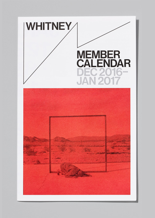
A real-world example of this composition technique can be found in the visual identity for the Whitney Museum designed by Dutch design studio Experimental Jetset. The identity system is based on a strict grid system where the vertical and horizontal lines of the content is broken up by a stretchable and skewed “W” that also functions as a logotype for the museum. The strictness of the grid system combined with the ever-changing dynamic logo makes for a good visual language for a white-wall museum that seeks to constantly renew itself through original exhibition work.
For designers who have a hard time creating compelling layouts from a blank canvas, this stricter approach to composition can serve as a concrete starting point for further exploration. The examples below show a number of variations of the same idea.


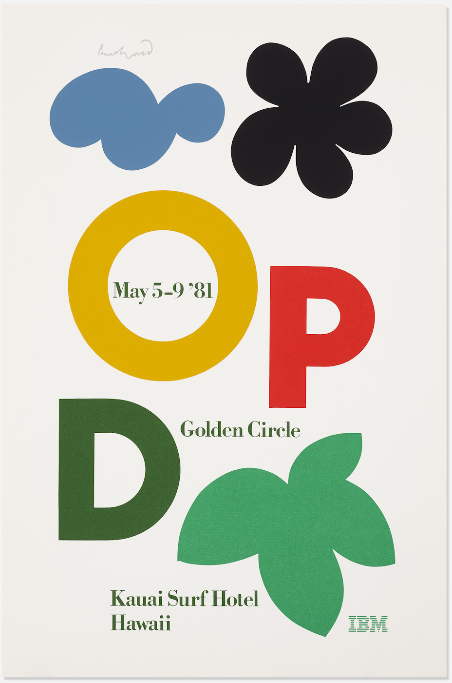
If this is an example of a strict interpretation of geometric composition, then what does it mean to design with a more lenient interpretation of the grid? The key is to find ways of removing the box-like aesthetic of the grid, and there are many ways of doing this. Let us first explore how to break the uniformity of the whitespace, and we will do this by allowing multiple pieces of content to use the same module. The overlapping content makes for a less formal composition while still adhering to the rules of the grid. The example below uses three horizontal divisons in order to allow content overlaps in the middle of the canvas. Notice how the heading is placed at the bottom of the bottom-most modules.
const margin = height / 15;
const allWidth = width - 4 * margin;
const allHeight = height - 5 * margin;
const moduleWidth = allWidth / 3;
const moduleHeight = allHeight / 4;
const headingHeight = moduleHeight / 2;

background(240);
noStroke();

translate(margin, margin);

fill(75, 185, 165);
rect(moduleWidth + margin, 0, 2 * moduleWidth + margin, 4 * moduleHeight + 3 * margin);

fill(120, 155, 155);
rect(0, moduleHeight + margin, 2 * moduleWidth + margin, 2 * moduleHeight + margin);

fill(30, 50, 50);
rect(0, 4 * moduleHeight + 3 * margin - headingHeight, 3 * moduleWidth + 2 * margin, headingHeight);

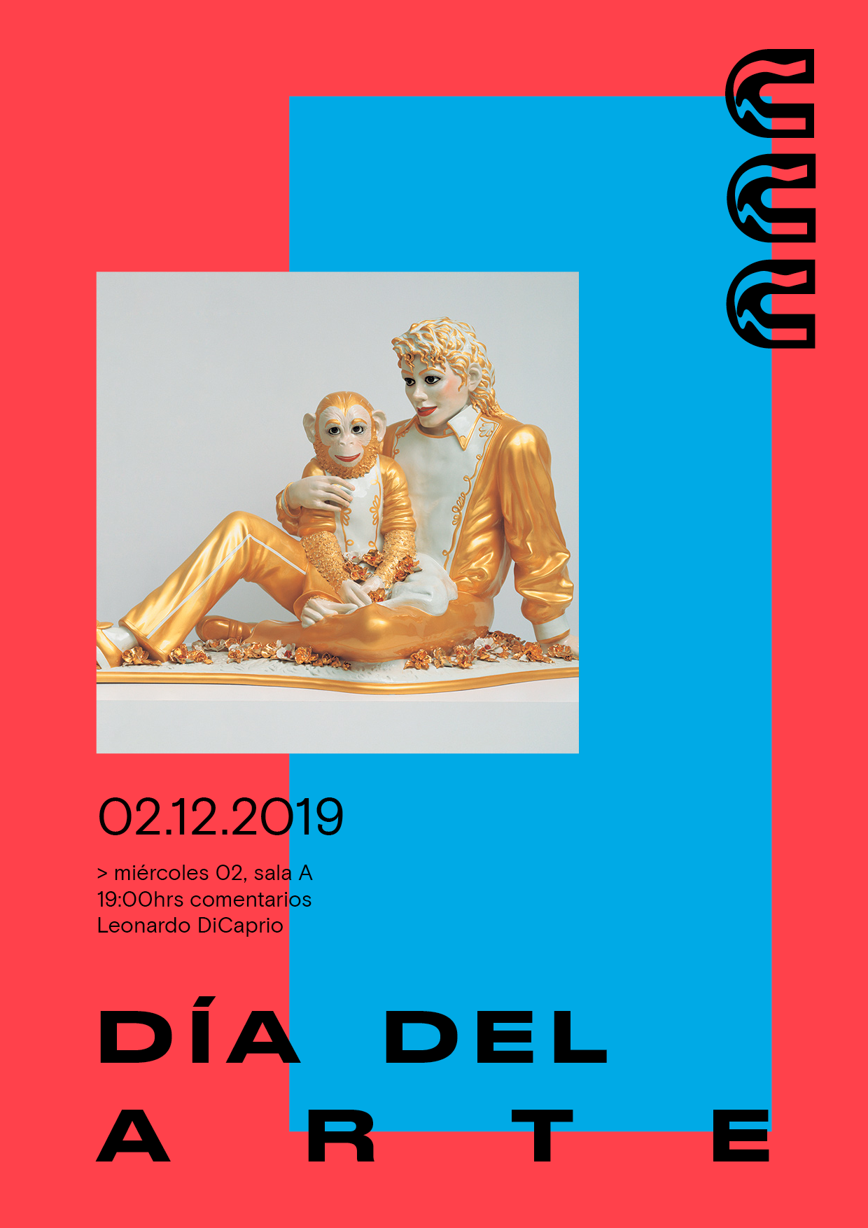
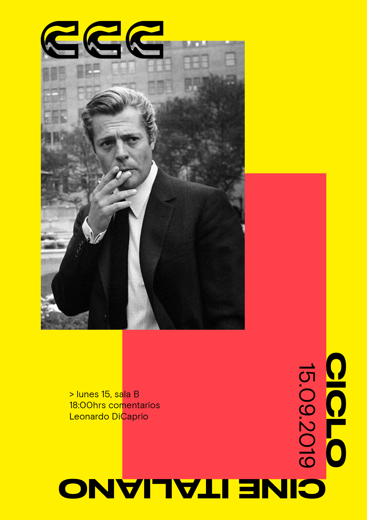
A real-world example of this approach can be found in the visual identity for CCC, an art cinema and cultural center in Santiago de Chile. The visual language created by the American design studio Design Systems International4 in collaboration with Simón Sepúlveda is based on a simple layout system with three basic building blocks: A logo with three iconic C’s, a grid system based on the rule of thirds, and a playful color palette. These elements can be combined to produce an endless number of assets for the institution. For an institution where most of the marketing material is created by a rotating team of volunteers, this simple but flexible layout system helps streamline their public communications, and the colored blocks produced by the geometric composition makes for an extremely recognizable identity. Notice how the text is placed around the margins of the canvas for a more playful expression.

The three designs below all use the same approach to create three different designs with overlapping content.


Another way to deviate from the strictness of the grid is to change the way our content is placed within the modules. Except for a few outliers, the strategy so far has been to scale the content to the full width and height of the module, and align the content at the top of the modules. We can open up more possibilities by scaling the content in different ways, and aligning the content to just one or two sides. This is demonstrated in the example below, where some images overflow the modules by the value of a margin, while other images shrink to align to a corner within their modules. This makes for a less organized layout where few of the shapes align, but without the chaos of a free-for-all layout.
const margin = height / 15;
const allWidth = width - 3 * margin;
const allHeight = height - 4 * margin;
const moduleWidth = allWidth / 2;
const moduleHeight = allHeight / 3;

background(240);
noStroke();
fill(75, 185, 165);

translate(margin, margin);

rect(0, margin / 2, moduleWidth, moduleHeight - margin);
rect(moduleWidth + margin, 0, moduleWidth, moduleHeight);
rect(margin / 2, moduleHeight + margin, moduleWidth + margin / 2, moduleHeight);
rect(moduleWidth + 2 * margin, moduleHeight + margin, moduleWidth - margin, moduleHeight + margin);
rect(0, 2 * (moduleHeight + margin), moduleWidth - margin, moduleHeight - margin);
rect(moduleWidth, 2 * moduleHeight + 3 * margin, moduleWidth + margin, moduleHeight - margin);

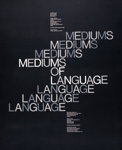
The following two examples demonstrate different ways of playing within the grid. The first poster by the American graphic design Paul Rand has a layout similar to the code example above. It is arguable whether Rand used a grid system at all to create this design, but the consistent margins and alignment of some shapes might be an indication that the approach was similar to ours. The second example is by the American graphic designer Jacqueline Casey, who is best known for her work as Director of MIT’s Office of Publications. Here, she plays with horizontal misalignment by dividing the canvas into many thin modules and offsetting the type from the center using the modules as a baseline for the typography. Combined with a black and white color scheme, the result is a rigid yet playful design that invites the reader to examine the text more closely.
The three examples below use the same approach to create designs that look less rigid while still adhering to the main lines created by the grid.

This chapter introduced a set of geometric composition techniques that can be used to construct graphic layouts by dividing the canvas into smaller modules that are in turn used to arrange the content. These ideas can help designers create a plan for the entire composition before focusing on individual pieces of content. In some way, geometrical composition is a way to think about the general before the specific, and this can be a blessing or a curse depending on how these ideas are used. As always, rules should not be followed blindly. Graphic design is above all a human endeavour, and geometric composition techniques should be used to explore layouts and generate new ideas suitable for the specific content, not as a prison for templating content into a visual monoculture. It should be mentioned that the techniques presented in this chapter were meant to introduce the concept of geometric composition to designers working in code, but P5.js cannot and should not be used for all purposes. Many designers will need to use grid systems when designing websites, but this will need to be done with CSS. It is my hope that even though the specifics of each programming language will vary, the overall approach to designing with grid systems in code will remain relevant.
The next chapter of this book is also devoted to the concept of grid systems. This will give us an opportunity to focus on key details related to the use of grid systems in code, including how to write reusable code that can be shared across projects, using more sophisticated grid systems, and even using multiple grid systems on top of each other in the same design.
Exercise
Pick one of your favorite musical artists and design a digital banner for this artist using the artist name, a short description, and an image. The banner is needed to promote the artist on the home page of a musical streaming service. Ask yourself whether the style of music calls for a rigid layout or a more loose interpretation of the grid, and try to come up with a layout that makes sense for your content. Make sure to use the code examples in this chapter if you are stuck.
- Arnheim, Rudolf (1974) Art and Visual Perception, p. 8. University of California Press
- Heider, G.M. (1977) More about Hull and Koffka, American Psychologist, 32(5), 383
- Kroeger, Michael (2008) Conversations With Students, p. 27. Princeton Architectural Press
- Design Systems International was co-founded by the author