A short history of geometric composition
“Anyone willing to take the necessary trouble will find that, with the aid of the grid system, he is better fitted to find a solution to his design problems which is functional, logical and also more aesthetically pleasing”
Joseph Müller-Brockmann1
This part of the book focuses on principles of geometric composition and how they can help designers create organized and beautiful layouts. The term geometric composition covers a range of techniques used to guide the positioning of elements in a design. This can be as simple as a ratio – such as the rule of thirds (⅓) where the page is split into three equally sized rectangles – or as sophisticated as a full grid system with multiple columns and rows that control the alignment of text and other shapes.


Before diving into the specifics of how to use these concepts when designing with code, we will first spend the rest of this chapter looking at examples of geometric composition from art history. This history will pay special attention to how new technology – first the printing press and then the computer – played a significant role in developing these ideas.
A brief critical note on the subject – especially the idea of the golden ratio – is necessary here. The golden ratio is best understood by imagining two lines, one long and one short. When the ratio between the long and the short line is the same as the ratio between the two lines combined and the long line, this is the golden ratio. That number happens to be 1.61803398875, and it can be used in all sorts of ways. For example, if you create a rectangle where the width is 1.61803398875 times larger than the height, it is called a golden rectangle. If you divide this rectangle into smaller rectangles using the same golden ratio and draw a curve through the corners of these smaller rectangles, you end up with a golden spiral. The golden spiral is the most popular visualization of the golden ratio, but do not get fooled by this complexity: The golden ratio is still just a number.

Many of us remember hearing about the golden ratio in elementary school or early art education, and the takeaway was likely something like this: The golden ratio, or the divine proportion, is a number that is universally agreed upon to be aesthetically pleasing when used to position elements of a design within the canvas. Because it is especially beautiful to the human eye, it has been used throughout history by artists to create masterpieces. The concept of the golden ratio has been used to describe everything from the architecture of the Parthenon in ancient Greece to the paintings of Leonardo Da Vinci, and a search for “The golden ratio in art” will reveal hundreds of papers claiming to have found the golden ratio in pretty much any possible artifact.
The only problem is that most of this likely is pure fiction. Although there are examples of artists who used the golden ratio extensively, many of these conclusions are cases of a post-rationalization where authors set out to find the golden ratio and so do it. This is no different than conspiracy theorists finding hidden symbols on the American dollar bills or fake shadows on photos from the moon landing. In a paper called Misconceptions about the golden ratio from 1992, George Markowsky argues:
“Generally, the mathematical properties [of the golden ratio] are correctly stated, but much of what is presented about it in art, architecture, literature and esthetics is false or seriously misleading. Unfortunately, these statements about the golden ratio have achieved the status of common knowledge and are widely repeated.”
George Markowsky2
As an example, the Parthenon was built in ancient Greece, and no source text indicates that the Athenians were aware of the golden ratio. Furthermore, one has to ignore large parts of the building’s foundation in order to fit a golden rectangle on the structure of the building3. Leonardo Da Vinci did illustrate a book named De Divina Proportione about ratios in art, but there is no indication that he used these ideas much in his own work. Although numerous academics have found the golden ratio in Da Vinci’s work, these discoveries appear to be both subjective and flawed4. It is important to separate fact from fiction when discussing systematic design principles, and this is especially true for the subject of geometric composition. Rather than beginning a fruitless search for such divine proportions to serve a gross simplification of the world, we will instead focus on a more concrete history of how technology long has inspired designers to use geometric constraints to ease the burden of their work. As these techniques developed, they became design methodologies used even when designers were not limited by the constraints of the machine, and they are today widely adopted by graphic designers to make consistent and organized layouts.
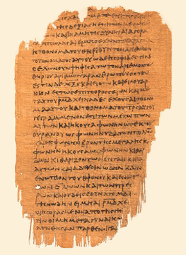
We will begin this story with an example that predates these ideas: The early handwritten book also called a codex. The codex was a significant improvement over the rolled papyrus, having stacked pages in a form that resembles the modern book. The popularity of the codex coincided – or was perhaps caused by – the rise of Christianity, and the earliest Christian manuscripts from the second century are all codices. These texts are missing most of the presentational techniques we know today: The texts have no headings, no letter case, and the lack of punctuation turn them into one long paragraph. These texts were merely a medium for communicating the spoken word, and little thought has been put into the book as a medium. Most important, they were written by hand without any guides to help the scribe. As a result, the number of lines varies greatly from page to page, the lines often slope, and the right margin changes based on how the scribe decided to break the words5.
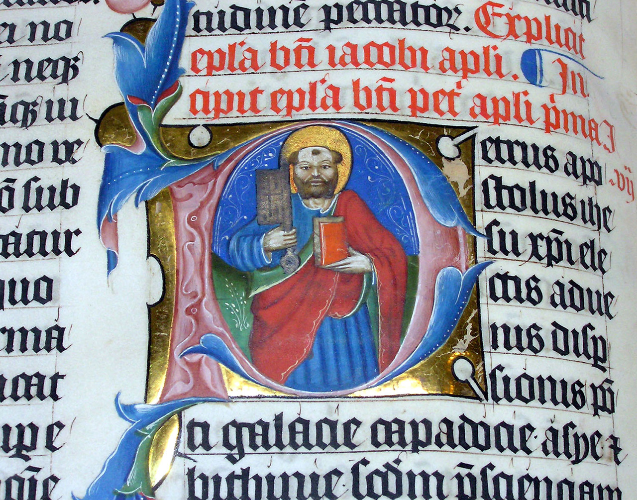
Compare this to the much later illuminated manuscripts – books written by hand in monasteries – that flourished in the Middle Ages. These texts are much more deliberate in their layout. They use Gothic script, a type of lettering that is very slow to write, and manuscript pages are often painted with colorful miniature illustrations. Most important, these manuscripts were not created from a blank page. Scribes would plan the design of the book, and central to this planning was the creation of geometric helper lines to guide the scribe while writing. First, a rectangle would be drawn on the page to indicate the page margins. Then, this rectangle was split into a grid of horizontal lines to guide the text while some parts were set aside for illustrations. Finally, the scribe would carefully write and illustrate the book according to the grid. This is in essence no different to how designers today divide a canvas into smaller pieces to organize their layouts.
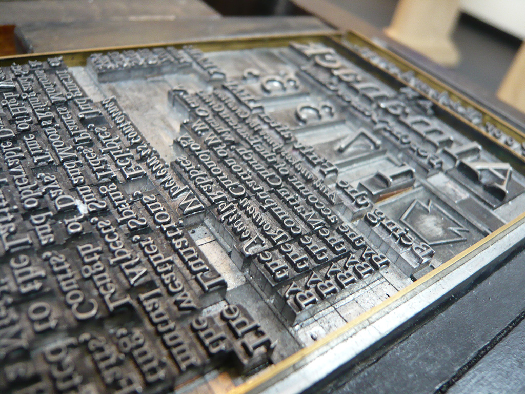
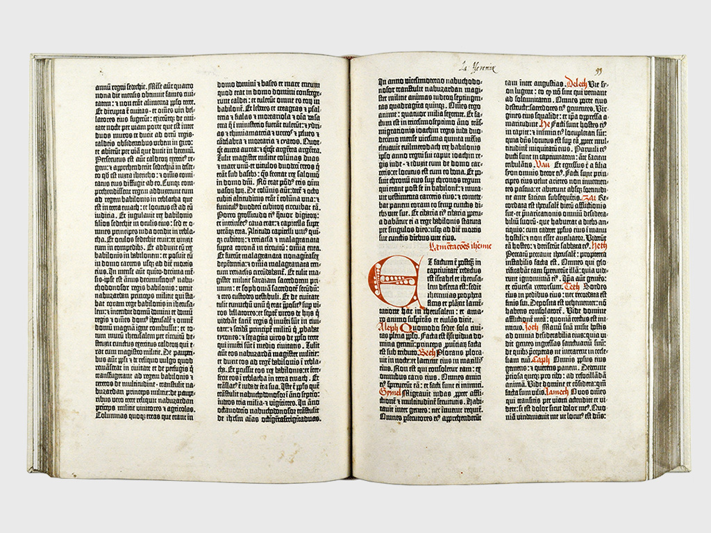
These methods changed from manual techniques to mechanical systems when first Bi Cheng in China (1045 AD) and later Johannes Gutenberg in Germany (1450 AD) invented movable type. This new printing technology used small clay, wood, or metal letter blocks that could be slotted onto a frame, inked and used to mass produce identical prints. One can imagine how the critics at the time must have sounded a lot like what we hear today about the computer: That these new machines constrain the artist and make the design products uniform. In the case of Gutenberg’s early printed Bibles, one can argue that the opposite is true. The printing press did force Gutenberg to think about all aspects of book design in a rectangular grid, but the creativity displayed within these constraints is remarkable. To achieve a neat two-column layout, each letter was produced in multiple widths so the line of text could be justified in both ends. The typeface itself was the result of months of careful work producing letters that were both a reference to the Gothic script of yesterday and the mechanical processes of tomorrow. The printing press did constrain the design, but printers found a world of creativity within these geometric grids. Gutenberg’s Bibles are, in the words of Stephen Fry, “much more beautiful than [they] need to be”6.
The early 1900’s saw a proliferation of new technology from the Industrial Revolution becoming available to artists and designers, and many of the artistic and political movements of this period incorporated these mechanical processes. Central to most of the European art movements (Italy’s Futurism, France’s Dadaism, Germany’s Bauhaus), as well as the Marxist movements in Russia and China, was the use of the printing press as a way to rebel against the notion of fine art. One example is the Italian Futurists who, inspired by urbanism and the machine, experimented with the established grid of the printing press. If Gutenberg’s life work was to fit designs into a rectangular grid, the Futurists saw it as their mission to break this grid.
“My revolution is aimed at the so-called harmony of the page, which is contrary to the flux and reflux, the leaps and bursts of style that run through the page. On the same page, therefore, we will use three or four colors of ink, or even twenty different typefaces if necessary”
Umbro Apollonio7
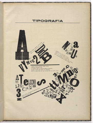
This design by Ardengo Soffici shows a deliberate breaking of the grid with rectangular letter blocks arranged in a chaotic way. These experiments might not seem terribly groundbreaking to the modern eye, but they had a drastic impact on the graphic style of the following decades.
As graphic design evolved from a printmaker’s task in the 1920’s to a flourishing profession in the 1950’s, these geometric composition techniques matured with it. In 1928, Jan Tschichold released Die Neue Typographie, a strict modernist manifesto that argued for the use of sans-serif typefaces and uniform, left-aligned grid layouts. Although Tschichold did not use the word grid nor formalize its use, most of the techniques of the modern grid system were present: The division of the canvas into smaller, uniform rectangles to guide the text on the page.
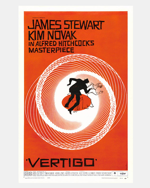
These ideas quickly spread throughout Europe, and – propelled by European emigration caused by the Second World War – to the United States. Here, the grid system was adopted in products of the Golden Age of Advertising in the 1950’s and 1960’s by designers such as Paul Rand and Saul Bass who championed the use of expressive shapes and typography within the confines of the grid. When we look at these design products today, they stand out as incredible examples of this duality: An artistic playfulness constrained by geometric principles.

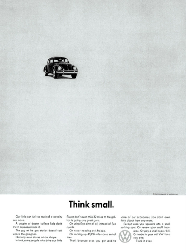
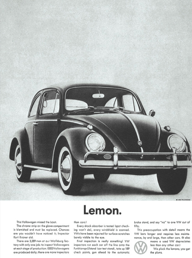
Tschichold’s modernist ideas are clearly visible in one of the most famous advertising designs of the postwar era – The Think Small Volkswagen campaign. The Volkswagen Beetle was originally designed by Ferdinand Porsche for the people of Adolf Hitler’s Third Reich, and selling this car to the American consumer was no small feat. With clever text copy and a very modernist look, the Think Small campaigns helped make the Beetle a massive success in the US market.
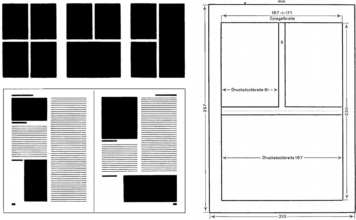
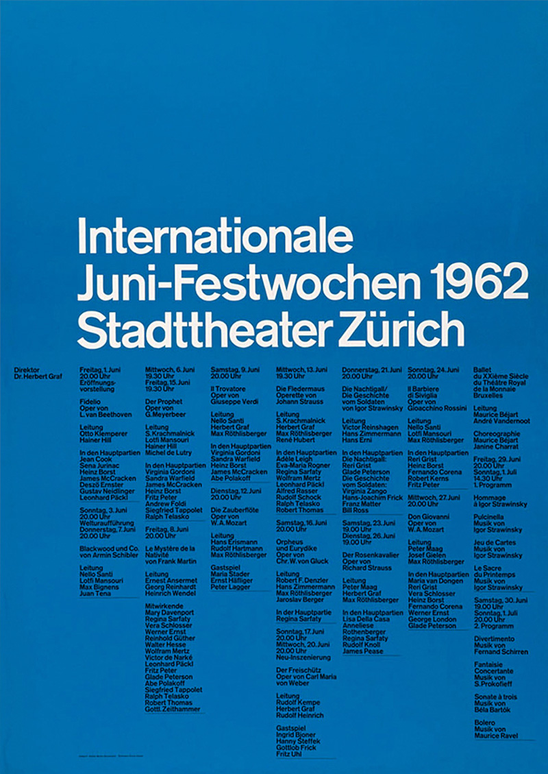
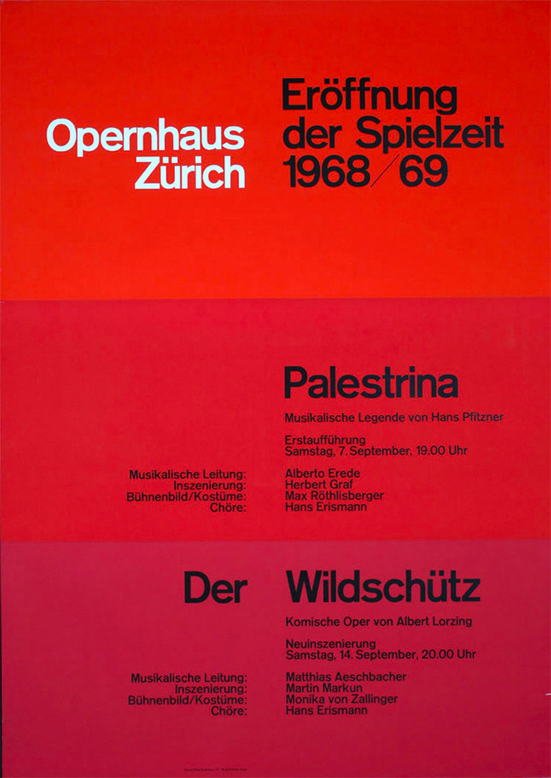
A new design aesthetic called the Swiss Style emerged in the 1960’s, where designers began arguing for an even more systematic and mathematical approach to design. Two books written by Swiss designers are considered central to this movement: Grid Systems in Graphic Design by Joseph Müller-Brockmann8 and Designing Programmes by Karl Gerstner9. Brockmann argued for an absolute minimalist design style and the use of grid systems to organize the elements of a design into a strict visual hierarchy.
It is important to understand how Brockmann’s concept of a grid system separates itself from his predecessors. Brockmann believed that a grid system should be absolutely uniform, created by dividing the canvas into equally-sized columns and rows. Designers could then use these basic building blocks – called modules – to flow text or images vertically along columns, horizontally along rows, or both. In Brockmann’s view, there was no place for the designer to manually tweak the size of some elements by eye. The beauty came from the strictness of the proportional grid.
It is fair to say that the Swiss Style represented an extremist view of how geometric composition should be used in visual design. For fans of this purely functional art, the work of Brockmann holds great clarity because of its strictness and lack of ornaments. For critics, the same designs are seen as cold and brutalist, lacking the creativity and playfulness seen in work by American colleagues.
The concept of a grid system has so far served two purposes. First, it is the byproduct of the technical manufacturing processes of design products. The printing press works by assembling small rectangular letter blocks on a plate, so the designer has to think about the design process in terms of a grid. In this case, the grid is a concrete limitation that designers have to work around. Secondly, grid systems are also a design methodology used by designers to achieve organized layouts even in places that do not have such technical limitations. When grid systems became popular in web design in the mid-2000’s, it was caused by a combination of these factors. On the one hand, HTML (the document format for websites) operate with rectangular elements that when rendered in a browser pushes subsequent elements down on the page. The column grid is therefore a natural container, as content can flow vertically without breaking the design. On the other hand, computers are not bound by the same limitations as mechanical systems, so the continued use of grid systems on the web today is as much a best practice that is independent of the constraints of the medium. A brief look at how nytimes.com, one of the most popular websites on the internet, evolved in its first decade might help illustrate this point.
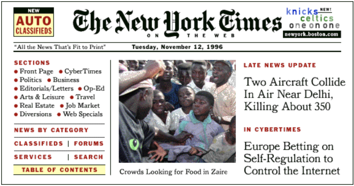
The New York Times launched their daily news website in January 199610, just a few years after the internet finished its transition from a private network of academic institutions to a public, commercial medium11. Although many of the web technologies we use today existed in some form, web designers were limited to a few basic techniques when creating websites. The first version of nytimes.com consisted of a single 575 x 300 pixel image split into clickable regions. As images provided the only way of creating consistent designs across browsers, this technique – called image mapping – was used heavily in the early days of the web. The design took much inspiration from the printed paper, featuring a centered logo, a date strip with the newspaper slogan (“All the news that’s fit to print”, ironically), and a three-column layout. Given that this image was created manually in a graphics program and not programmatically, many of the systematic qualities that we know from today’s grid systems on the web were missing: The columns were not based on a uniform unit, and the content did not extend vertically below the screen area. As many new technologies, early web pages copied the form of existing technologies, and this web design is clearly reminiscent of the newspaper grid.
At the end of 1998, nytimes.com had replaced the static image with individual HTML elements, allowing their content to be updated individually throughout the day. This layout featured many of the techniques we consider vital to a modern user experience on the web: A sidebar with stacked menu navigation, listings of articles within a vertical column that extends beyond the screen, and tags to categorize this content. Still, this wider three-column layout did not conform to a uniform measurement for the grid columns, and pages varied in their presentation techniques.
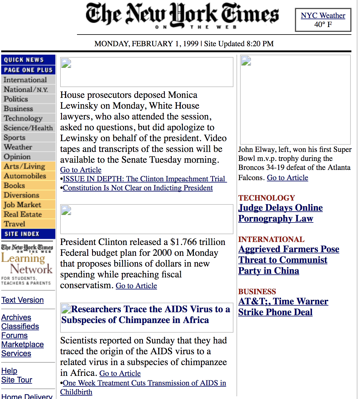
This layout used HTML attributes and not a shared CSS file to achieve the design. This means that each page was responsible for its visual design, and much of the variation in grid measurements could be explained by the fact that designers at the New York Times weren’t forced to think systematically about the design. As the use of CSS accelerated in the following years, web designers began to argue for bringing the strict modernist grid to the web.
The first Google result for “CSS grid system” is from an article titled Flexible Layouts with CSS Positioning by Dug Falby on A List Apart in 2002. In the article, Falby argues for a universal, flexible layout system that can adapt to the size of the browser. In 2004, the Design Director for New York Times Online, Khoi Vinh, published a blog post titled Grid Computing …. and Design where he argued for the use of uniform grid units in web design:
“The new layout uses eight columns and four ‘super columns,’ and it shoehorns everything into that structure [...] Each column is 95 pixels wide and separated by a 10 pixel gutter, which means I can create graphics of logical widths in increments of roughly 95 pixels each”
Khoi Vinh12
This is the first online reference that explicitly describes a technique for web layouts that mirrors the techniques presented in Brockmann’s Grid Systems in Graphic Design. Vinh further developed these ideas in a presentation with Mark Boulton from South by Southwest in 2008 titled Grids are Good. Also in 2008, popular CSS libraries such as 960 Grid System and Blueprint CSS implemented this stricter grid philosophy, and these ideas have fundamentally not changed in modern CSS libraries used to this day.
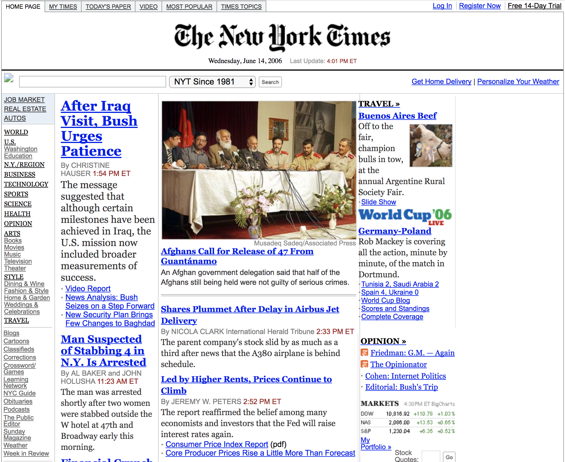
The New York Times website embraced many of these ideas with a 970px grid system in 2006. Although not strictly pixel perfect, the central design principle is an 11-column, 82-pixel column grid with a visual style that is visibly stricter than its predecessor. This format was used until a major redesign in 2013.
Grid systems are an integral part of digital design today. When building digital products, designers use the grid to establish empty containers that can be dynamically filled with content for the individual user. The way these grid systems are applied is essentially no different from how printmakers used them centuries ago, but one could argue that there is an even greater need for them today with the explosion of digital content: Digital design products must adapt to different screen sizes and show dynamic content, so there is no true original design. This forces designers to think systematically about visual layout. Hopefully, this short history has helped clarify how designers through centuries have used geometric composition techniques to create beautiful and balanced designs – in print and on the web. In the following chapters, we will investigate how to apply these ideas to our own designs in P5.js.
- Müller-Brockmann, Josef (1981) Grid Systems in Graphic Design, p. 9. Arthur Niggli
- Markowsky, George (1992) Misconceptions about the Golden Ratio, p. 2. The College Mathematics Journal, Vol. 23
- Markowsky, George (1992) Misconceptions about the Golden Ratio, p. 8-9. The College Mathematics Journal, Vol. 23
- Markowsky, George (1992) Misconceptions about the Golden Ratio, p. 10-11. The College Mathematics Journal, Vol. 23
- Malik, Peter (2017) P. Beatty III (P47): The Codex, Its Scribe, and Its Text, p. 31 - 38. New Testament tools, studies and documents, Vol. 52
- Fry, Stephen (2008) The Machine That Made Us. BBC UK
- Apollonio, Umbro (2009) Futurist Manifestos, p. 104. Tate Publishing
- Müller-Brockmann, Josef (1981) Grid Systems in Graphic Design. Arthur Niggli
- Gerstner, Karl (1964) Designing Programmes. Arthur Niggli
- https://www.nytco.com/who-we-are/culture/our-history/#2000-1971-timeline
- Peter, Ian (2004) So, who really did invent the Internet?. The Internet History Project
- https://web.archive.org/web/20050106024725/http://www.subtraction.com:80/archives/2004/1231_grid_computi.php