Perceptually uniform color spaces
“In visual perception a color is almost never seen as it really is - as it physically is. This fact makes color the most relative medium in art.”
Josef Albers (1963), Interaction of Color
If you rounded up a group of graphic designers and asked them to define the concept of perceptually uniform color spaces, there is a good chance that none of them would know what to say. On the surface, perceptual uniformity is somewhat easy to explain: These color spaces are human-friendly alternatives to color spaces such as sRGB, and they are incredibly helpful for designers working in code. Despite of this, they can feel daunting to use in programmatic designs. Perceptually uniform color spaces have roots in scientific color theory, and this community does little to make them accessible to a larger audience. In this chapter, we will look at the concept of perceptually uniform color spaces, and answer some common questions related to them: What are they? Why do we need them? How can we use them in code?
What is wrong with sRGB?
Let us pretend that you want to design a poster with ten squares changing in color from green to blue in equal steps. “Easy”, you might say, and whip up some code that creates an equal change in hue between each rectangle. Convinced that the result will be a nice looking gradient, you are surprised to see the following output after running the code.
You might notice something odd about this colored strip of rectangles. Although the colors change from green to blue, they appear to change a lot more towards the end of the strip. The green colors look almost identical, while the blue colors are more diverse. It also has a lot of variation in the lightness of the colors, with the cyan colors in the middle looking brighter than the blue colors. This happens because the default sRGB color space (and any color model built on it like HSV and HSL) is irregular, which means that even though the rectangles have evenly spaced hue values, the corresponding effect is not linear to the human eye.
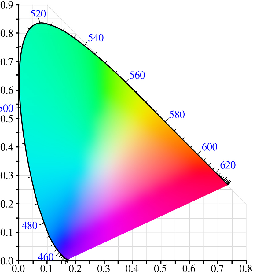
To explain why, we need to look at the chromaticity diagram we briefly discussed in the last chapter. This diagram is the result of extensive scientific experiments in the 1930’s, and it plots the visible color spectrum onto a scale based on the human vision. The first thing you might notice is that the diagram has a lot of green in it. The blue numbers displayed on the edge of the color spectrum show the wavelength of the corresponding color, and you will notice that the colors from around 520nm to 560nm all look green. But if you take another 40nm range, e.g. 460nm to 500nm, it includes a much broader set of colors between blue, cyan, and green. This explains why a majority of the rectangles in our design above are green, and why we see a sudden shift towards blue at the end of the scale: moving linearly through the hues will look disproportionate to the eye. If we want to operate with color as it relates to the human vision, we need a color space built on these human measurements, and that is what perceptually uniform color spaces are.
The following rectangles also have an even distribution in hues, but this time the colors were created with a perceptually uniform color space. Notice how the colors remain constant in their lightness, and that the hues are evenly distributed to make a linear color gradient.
Why do we need perceptually uniform color spaces? Because working with color in code is different than working with color in traditional design tools. Traditional tools encourage designers to think in manual workflows with the color picker as the primary way of choosing color combinations. In this scenario, designers use their eyes to decide whether a color is right or wrong, and the RGB values play no role in this decision. Code is different, because programming languages encourage designers to think about colors as numbers or positions within the chosen color model. This skill is hard to learn if the numbers do not correspond with the output. Perceptually uniform color spaces allow us to align numbers in our code with the visual effect perceived in our viewers.
In some cases, perceptually uniformity is essential. A simple example like wanting to choose a random color to be readable against a dark background can be hard in irregular color spaces, because colors with the same lightness or brightness vary greatly in how bright they appear (blue and yellow both have 100% brightness in HSV, but blue is much darker than yellow). One would need to do all sorts of calculation based on the chosen hue to make the random colors equally bright.
If designers are not aware of this, it can even lead to misleading designs. A good example is the use of continuous color scales in data visualization. For certain map types, designers use a gradient to color geographic areas to reflect the value of a data point, and the user can compare colors between regions to get a sense of the data. If the designer created the color scale in a regular color space, the perceived colors will be different from the data points reflected in the color values. To have the design show the actual data, a perceptually uniform color space is required.
A better solution
The International Commission on Illumination (CIE) created the aforementioned chromaticity diagram in the 1930’s to solve this problem. This diagram is actually a 2D view of a color space called CIEXYZ, which in the 1970’s was replaced with the slightly improved CIELUV and CIELAB color spaces. It is hard to describe how these color spaces work without going into the underlying math, but they generally allow you to specify color, not in light mixes, but in dimensions that relate more to the human vision, and they do sophisticated color transformations to ensure that these dimensions reflect how the human vision works. For example, the CIELUV color space has two dimensions – u and v – that represent color scales from red to green and yellow to blue. To create a color in the CIELUV color space, one has to define the lightness of the color (l), whether it is reddish or greenish (u), and whether it is yellowish or bluish (v). Similarly, humans compute signals from our retina cones via the opponent process model, which makes it impossible to see reddish-green or yellowish-blue colors.
Even though these color spaces are based on human perception, they are not intuitive when working in code. Like a RGB color space, it can be hard to guess which LUV numbers are required to create e.g. a dark purple or bright cyan. Thankfully, perceptually uniform color spaces can also remap their dimensions in different color models, so designers can work with more intuitive dimensions, while keeping the perceptual uniformity.
HSLuv
The HSLuv project is one of the more recent attempts at making these color spaces more intuitive. It allows you to use the CIELUV color space in the same dimensions as the HSL color model. Referred to as a human-friendly HSL, the original code was written in the Haxe programming language, but the project is now implemented in most of the popular programming languages, including JavaScript.
Before diving into the code-specifics, it is important to understand how HSLuv differs from HSL. HSLuv allows you to define a color based on three dimensions – hue, saturation, and lightness – but contrary to a HSL color model based on sRGB, colors that share the same value for a dimension are guaranteed to look similar. Two colors with an identical lightness value will look equally bright, and two colors with the same saturation will have the same perceived color purity. Like HSL, the saturation and lightness dimension is represented as a percentage between 0 and 100, but in HSLuv those percentages reflect the perceived color mixing. A gray color with a lightness of 50 is guaranteed to be mid-gray.
Even though it is not a built-in color mode, HSLuv works great with P5.js. To use the library, you first need to download the latest HSLuv release, and then include the library file in your HTML file. This makes the HSLuv color conversion functions accessible in your sketch.
<script src="p5.min.js" type="text/javascript"></script>
<script src="hsluv.min.js"  type="text/javascript"></script>
Every implementation of HSLuv includes four functions that can be used to convert between HSLuv and RGB. We can use one of these functions – hsluvToRgb() – to convert the HSLuv color values into RGB values that the fill() and stroke() functions can understand. The hsluvToRgb() function expects an array with three values – the desired hue, saturation, and lightness of the color – and returns another array with RGB values in the range of 0 to 1. Because P5.js expects RGB values between 0 and 255, we need to multiply the array values to scale them up. This boils down to two lines of code, which is illustrated in the example below.
// First convert the HSLuv values to a RGB array
const rgb = hsluv.hsluvToRgb([0, 50, 50]);

// Then use the RGB values in a scale of 0-255
fill(rgb[0] * 255, rgb[1] * 255, rgb[2] * 255);
This means that every time you have to create a perceptually uniform color for the fill() or stroke() function, you need an extra line of code to handle the HSLuv to RGB conversion. This can be prevented by creating small helper functions that wrap these two lines of code.
You can now use these two functions instead of the built-in fill and stroke functions. It is essentially a way to make your own colorMode in P5.js without using the colorMode function. Below is a quick example to demonstrate how to use them.
noStroke();
fillHsluv(0, 100, 50);
ellipse(150, height/2, 200, 200);

noFill();
strokeWeight(5);
strokeHsluv(120, 100, 50);
ellipse(300, height/2, 200, 200);

noStroke();
fillHsluv(240, 100, 50);
ellipse(450, height/2, 200, 200);
Now that we have the ability to use a perceptually uniform color space in P5.js, we can replicate the rectangle gradient experiment from the beginning of the chapter. The following example uses the same color values to draw a strip of rectangles using both HSL and HSLuv. Notice how the colors in the latter example look equally bright.
const w = width / 10;

colorMode(HSL);
for(let i = 0; i < numRects; i++) {
  fill(i * 18, 100, 50);
  rect(i * w, 0, w, height/2);
}

colorMode(RGB);
translate(0, height/2);
for(let i = 0; i < numRects; i++) {
  fillHsluv(i * 18, 100, 50);
  rect(i * w, 0, w, height/2);
}
We can also use these new functions to choose random colors that are readable against a specific background color. The example below shows a line of text in random colors using both HSL and HSLuv. Notice how the first example sometimes use very bright yellows even though the lightness is constant. The latter example that uses the perceptually uniform color space does not have this problem.
const fontSize = 30;
textSize(fontSize);

translate(50, 50 + fontSize);
colorMode(HSL);
for(let i = 0; i < 10; i++) {
  fill(random(360), 100, 50);
  text("Can you read this line of text?", 0, i * fontSize);
}

colorMode(RGB);
translate(0, 340);
for(let i = 0; i < 10; i++) {
  fillHsluv(random(360), 100, 50);
  text("Can you read this line of text?", 0, i * fontSize);
}
Even though P5.js does not understand the concept of perceptually uniform color spaces, this chapter has demonstrated how to use the HSLuv JavaScript library to convert from a perceptually uniform color space into the sRGB color space that P5.js uses. In the coming chapters, we will use this technique to procedurally generate color schemes and use them to create dynamic designs in P5.js