Color schemes
Effective use of color is vital to the success of any design project. Imagine a yellow Coca-Cola logo or the Mona Lisa painted in a saturated pink, and you might realize that the choice of colors has a drastic impact on any design. This does not mean that colors always have a clear semiotic purpose. While it might be obvious why stop signs are painted red (alert, danger, there will be blood if you ignore this), most color schemes are harder to interpret so directly. This leaves us with an art form that, like graphic design in general, is both objective and subjective. It is objectively a bad idea to use yellow text on a white background, because the lack of contrast makes the text hard to read. Likewise, one should not use red and green as primary colors in a data visualization when approximately 8% of men world-wide suffer from red-green color blindness 1. It is important to know these rules when working with color, as they enable designers to create graphics that are accessible to a majority of users. However, to master the art of color combination, designers also have to know how color is used in different cultures and contexts, observe current trends in the arts, and develop a personal style based on this knowledge. Because of this, many authors have struggled to create good ways of teaching designers how to think about color combination.
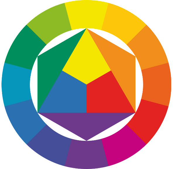
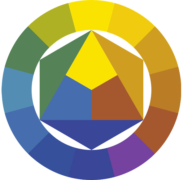
One popular method is to create categories of color schemes named after the relationship between the hues of the colors in each scheme. These categories are given names such as complementary (two colors with opposite hues), triadic (three colors spaced evenly across the color spectrum), and tetradic (four colors spaced evenly across the color spectrum). Authors also include a more hybrid set of categories for color schemes that do not fit in any of the former categories. One explanation for the popularity of this approach might be that teachers can visualize the categories by placing shapes on the color circle, and students can change the dimensions of these shapes to create variations of the color schemes. This technique is described in many books about graphic design, and you will often encounter these terms in design critiques.
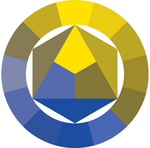
Even though this systematic approach might seem like a perfect fit for this book, I believe the method to be highly problematic. One problem is that color schemes within a single category do not have any coherent visual effect. Triadic and tetradic color schemes can look remarkably similar, even identical, if the spacing between hues is tweaked slightly. Also, the visual effect of a pure triadic color scheme in the sRGB color space is very different from the same color scheme in CIELUV. Worst of all, this approach tends to ignore the saturation and lightness dimensions, which are left for designers to figure out for themselves. The three color schemes below all have the same hue values, but produce wildly different visual effects by changing their saturation and lightness values. A color theory that ignores two-thirds of the color dimensions will not help designers make better decisions.
Instead, this chapter will present a color theory built around the three dimensions of the HSL color model. By focusing on the hue, saturation, and lightness of colors – and how these dimensions interact – designers can learn how changes in code are reflected visually, and compose interesting color combinations from this knowledge. In the following, we will go through these dimensions in reverse order, using the HSLuv library to ensure that changes in our code reflect actual perceptual changes in color.
Lightness
The lightness of a color determines how much black is mixed into the color (See Color Models and Color Spaces). The contrast of light and dark is a significant one, and even though we can create contrasts between colors by manipulating any of the HSL dimensions, the term ‘contrast’ most times refers to changes in lightness. The examples below demonstrate the effect of both a low-contrast and a high-contrast color scheme. The first example appears soft and light, which is a result of the high lightness values with small differences in lightness between each color. The second example appears bolder and has a significant positive/negative effect caused by the large differences in lightness for neighbouring colors.
fillHsluv(0, 0, 0);
rect(0, 0, width, height);
fillHsluv(0, 0, 50);
rect(145, 95, 375, 200);
fillHsluv(0, 0, 100);
rect(85, 155, 375, 200);
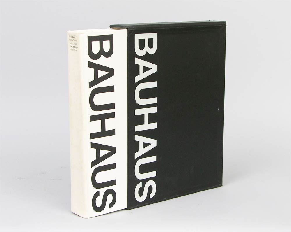
Muriel Cooper was a highly influential graphic designer who did important work in early digital design and user interface design. As co-founder of the MIT Media Lab and Design Director of MIT Press, she oversaw production of more than 500 books, and she is widely known for her black and white designs. Below are two of her more famous designs that rely solely on the lightness dimension.
Choosing a proper contrast is especially important when working with text, as readability is determined by the contrast between text and background. The World Wide Web Consortium recommends in their Web Content Accessibility Guidelines that body text should have a contrast ratio of at least 4.5:1 (or lower than 0.222 as a fraction), and they provide the following formula to calculate this contrast ratio for two lightness values.
const contrastRatio = (l1 + 0.05) / (l2 + 0.05);This formula requires the two lightness values to be provided in relative luminance, which refers to the Y dimension in the CIEXYZ color space. To calculate the W3C contrast ratio for a HSLuv color, we therefore first need to convert the lightness value into the CIEXYZ color space, and then use the formula above to calculate the contrast ratio. This is demonstrated in the code example below, where the contrastRatio() function can calculate this contrast ratio based on two HSLuv lightness values.
function lightnessToLuminance(l) {
  if (l <= 8) {
    return 1.0 * l / 903.2962962;
  } else {
    return 1.0 * Math.pow((l + 16) / 116, 3);
  }
}

function contrastRatio(l1, l2) {
  l1 = lightnessToLuminance(l1);
  l2 = lightnessToLuminance(l2);
  return (l1 + 0.05) / (l2 + 0.05);
}

function setup() {
  console.log(contrastRatio(40, 70)); // BAD! 0.35521707859730733
  console.log(contrastRatio(40, 90)); // GOOD! 0.19988073069469958
}
Lightness plays an important role in any color scheme, both when it comes to accessibility and aesthetics. Like the previous exercises in this book, it is recommended that aspiring designers practice designing only in black and white to learn how to establish proper contrast in their designs. ‘What does it look like in black and white’ is a good question to ask if a design seems cluttered, as it can reveal a lack of contrast between shapes in the design.
Saturation
The saturation of a color controls the purity of the color from grayscale to full color (See Color Models and Color Spaces). You can use this dimension to create color combinations that range from the very muted to the extremely bright. The two examples below use the same lightness and hue values, and differ only in their saturation values.
fillHsluv(40, 30, 65);
rect(0, 0, width, height);
fillHsluv(10, 40, 40);
rect(145, 95, 375, 200);
fillHsluv(75, 50, 85);
rect(85, 155, 375, 200);
fillHsluv(40, 100, 65);
rect(0, 0, width, height);
fillHsluv(10, 100, 40);
rect(145, 95, 375, 200);
fillHsluv(75, 100, 85);
rect(85, 155, 375, 200);
In user interface design, saturation is often used to distinguish passive and active interface components. Apple’s iOS operating system utilizes a desaturated color scheme for general interface elements, but fully saturated colors are used for key actions such as active toggle buttons and app notifications. This makes it possible for users to quickly interpret the state of the interface and notice when a new app event happened, like an LED lighting up on an old switchboard.
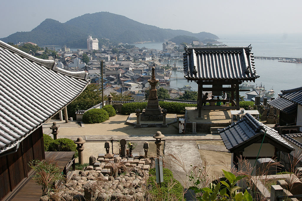
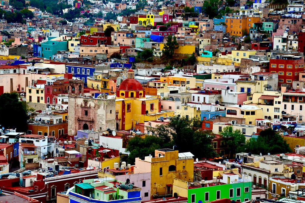
A good analogy to consider when working with saturations of color is the way many countries have distinct ways of painting houses in their cities. The saturations of these paints can vary greatly, and although these colors do not have any inherent meaning, they do say something about the time, place, and people. Imagine a small village in Japan with its muted, desaturated colors, and compare this to a place like Mexico, where houses are painted in very pure, saturated colors. These colors reflect the culture around them, and you should consider your content in the same way: Does it demand lively colors or a subdued, modernist scheme? The saturation of your colors is the key to this.
Hue
The hue dimension determines which actual color to show as represented by color names such as red, green, and blue (See Color Models and Color Spaces). As mentioned in a previous chapter, there is no coherent theory on which hue combinations produce harmonic results. Although many have tried, it is impossible to make a generalized theory about such a thing. 2 However, it can be beneficial to draw some conclusions from how hue combinations exist in the real world.
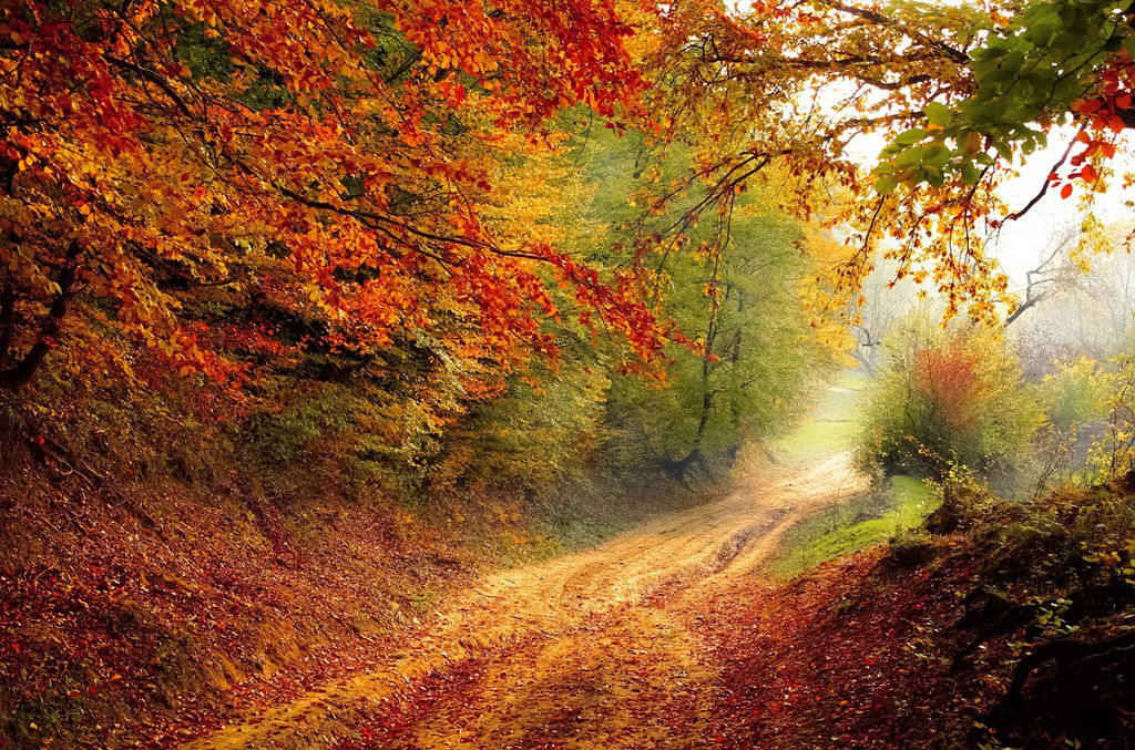
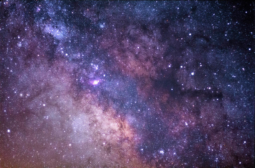
In nature, we often see small hue differences in the red-green parts of the color spectrum. In the spring, trees and plants will take on an almost monochrome bright green color scheme, but as the season turns to fall, these colors will spread slightly into a multitude of analogous colors of green, yellow, and red. You will often find such hue combinations in design products looking to evoke feelings of tranquility or peace, such as yoga studios, organic food products, and wedding invitations. A different type of analogous color scheme can be found in photos from outer space, where brighter colors in the blue/green parts of the spectrum create an almost alien effect. These colors are often used in technology or software products that want to appear streamlined and deliberately manufactured. It is not a coincidence that Apple and Microsoft stores look like the inside of a spaceship: They are designed to make customers feel like they entered a state-of-the-art science lab, because it makes them accept the higher price point. These are two types of color schemes with colors close to each other on the spectrum, but with very different visual effects.
fillHsluv(75, 95, 70);
rect(0, 0, width, height);
fillHsluv(35, 90, 40);
rect(145, 95, 375, 200);
fillHsluv(55, 100, 80);
rect(85, 155, 375, 200);
fillHsluv(270, 65, 15);
rect(0, 0, width, height);
fillHsluv(295, 70, 55);
rect(145, 95, 375, 200);
fillHsluv(278, 100, 73);
rect(85, 155, 375, 200);
A more profound effect happens when the distance between hues is increased. However, this statement can be deceiving. Although colors close to each other have a nice, analogous effect, colors on opposite sides of the color circle do not necessarily have the most pronounced hue contrast. The visual effect of two hues cannot be calculated by a simple formula, as much is determined by the actual hues chosen, how they are used in a design, as well as their saturation and lightness values. Nevertheless, it important to consider the spacing of hues like any other relationship in the design process: Does my content demand flat, monochrome colors or a varied burst of the color palette?
.We cannot discuss the hue dimension without mentioning the various types of color blindness that makes it hard for many to distinguish certain hues. The most prevalent color blindness is red-green, which makes it hard to distinguish red and green hues from each other. If the green retina cone is severely damaged, some people can only see the color blue. A more infrequent type of color blindness is blue-yellow, where blue, yellow, and green is indistinguishable. Also, in the rarest of cases, some people have complete monochrome vision. Up to 8% of men and 0.5% of women worldwide suffer from color blindness 3. This means that a color scheme, especially one needed for instructional use, should not rely solely on hues to create color contrasts. Lightness should always be considered, as the ability to distinguish colors by contrast is shared by almost anyone who are not vision-impaired.
Color scheme examples
These three dimensions of color can inspire a lifetime of experiments with color combination. While some color schemes consist of colors that only vary in one dimension (such as some monochrome designs), most color schemes combine changes in hue, saturation, and lightness to achieve a palette of colors. The Brooklyn-based chocolate producer Mast Brothers is famous for their colorful packaging designs where colored patterns are used to denote the flavor profile of the chocolate. These patterns provide a great case study of how the three dimensions of color can be manipulated to create different expressions.
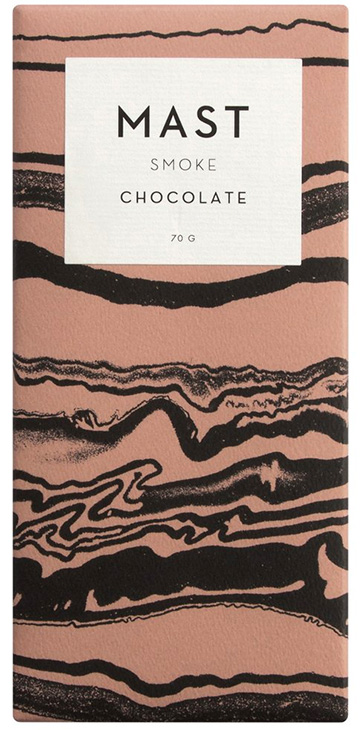
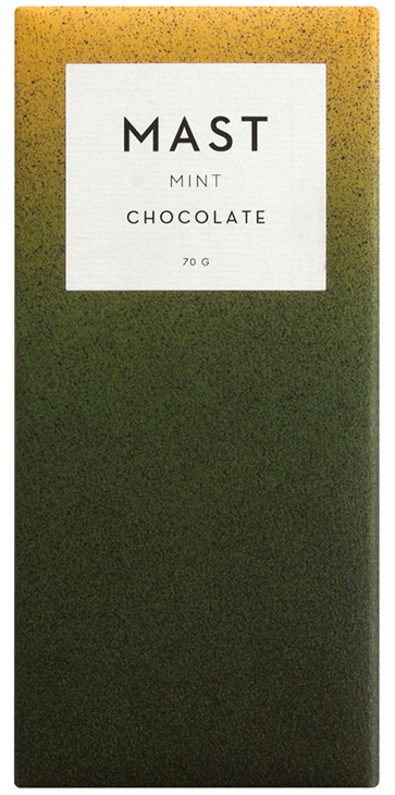
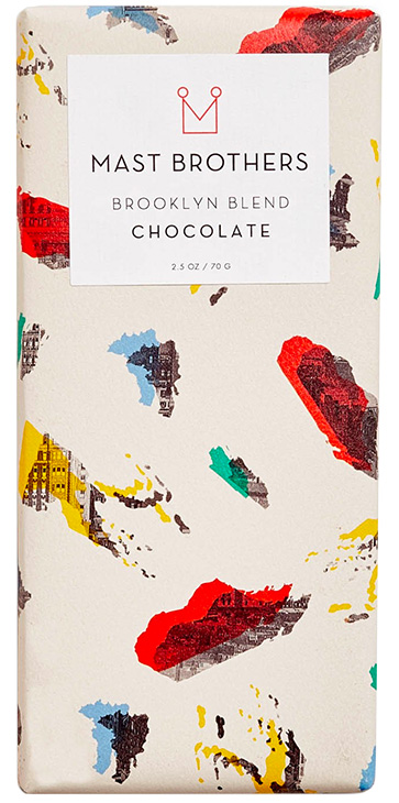
The first pattern is for a dark chocolate made with smoked beans, and the designer has chosen a high-contrast, monochrome color scheme with wavelike shapes to imply smoke floating in the air. Notice how these colors do not seem ‘natural’ per se, but are chosen to convey the taste of the product. The second pattern is for a dark chocolate with mint leaves and features a gradient of colors changing in hue and lightness from dark green to bright yellow with a constant saturation in the 50’s. The gradient provides for an interesting way of visualizing the two distinct flavors that despite their different characteristics blend well together. The final pattern features a four-color scheme on top of a lighter background where saturated colors with large hue contrasts are used to color paint-like shapes. A playful and creative design for the borough of Brooklyn.
Procedural color schemes
So far we have manually hard-coded color values to create color schemes. To really take advantage of the fact that we are using code to generate these designs, we should investigate how to procedurally generate these colors. That is, use a loop to create a lot of colors in just a few lines of code. This means looking at the color() function and how to dynamically create color objects with a loop.
The color() function in P5.js can be used to create a reusable color object, that can be used in the fill() and stroke() functions again and again. This means that, rather than having the same color values scattered throughout the code, we can assign a single color object to a variable on top of our code, and refer to this variable whenever the color needs to be used. Consider the following code where the same red color is used multiple times.
First use of red
fill(225, 35, 35);
rect(50, 50, 200, 180);

fill(40, 185, 155);
rect(200, 100, 200, 180);
Second use of red
fill(225, 35, 35);
rect(350, 150, 200, 180);
This example can be rewritten using the color() function, so the color values appear only once in the code.
Define the color object once
const red = color(225, 35, 35);
Use it here
fill(red);
rect(50, 50, 200, 180);

fill(40, 185, 155);
rect(200, 100, 200, 180);
Use it here
fill(red);
rect(350, 150, 200, 180);
To use the color() function with HSLuv values, we need to create a small function that performs the HSLuv to RGB conversion before creating the color object. Besides the use of the color() function, this function is identical to the fillHSluv() and strokeHsluv() functions from the last chapter. Remember that you must include the HSLuv JavaScript file for this to work.
function colorHsluv(h, s, l) {
  const rgb = hsluv.hsluvToRgb([h, s, l]);
  return color(rgb[0] * 255, rgb[1] * 255, rgb[2] * 255);
}

const red = colorHsluv(225, 35, 35);
fill(red);
Now, what if we want to use multiple colors in a design? It would make sense to just add more variables to the code above. Although that is perfectly fine for just a few colors, it does not make sense for a large number of colors. In this scenario, it is more sensible to use an array that allows for colors to be added and removed without introducing new variables. The code below stores three colors in an array and uses them to draw a color scheme.
const colors = [
  colorHsluv(40, 100, 65),
  colorHsluv(10, 100, 40),
  colorHsluv(75, 100, 85)
];

fill(colors[0]);
rect(0, 0, width, height);
fill(colors[1]);
rect(145, 95, 375, 200);
fill(colors[2]);
rect(85, 155, 375, 200);
Finally, we can use a loop to dynamically create colors objects. We do this by using an empty array, and pushing a new color object to the array on every loop iteration. This examples uses the random() function to ensure that the colors are different between each run of the loop.
Start with empty array
const colors = [];
for(let i = 0; i < 3; i++) {
Push new color with random hue, saturation, and lightness into array every time
  colors.push(
    colorHsluv(
      random(360),
      random(100),
      random(100)
    )
  )
}

fill(colors[0]);
rect(0, 0, width, height);
fill(colors[1]);
rect(145, 95, 375, 200);
fill(colors[2]);
rect(85, 155, 375, 200);
With all these concepts in place, we are ready to procedurally generate color schemes. One strategy – which is probably also the simplest – is to stick with random(), and create different types of color schemes by changing the values passed to the random() function.
const colors = [];
for(let i = 0; i < 3; i++) {
  colors.push(
    colorHsluv(240, 20, random(100))
  )
}

fill(colors[0]);
rect(0, 0, width, height);
fill(colors[1]);
rect(145, 95, 375, 200);
fill(colors[2]);
rect(85, 155, 375, 200);
const colors = [];
for(let i = 0; i < 3; i++) {
  colors.push(
    colorHsluv(random(360), 90, 50)
  )
}

fill(colors[0]);
rect(0, 0, width, height);
fill(colors[1]);
rect(145, 95, 375, 200);
fill(colors[2]);
rect(85, 155, 375, 200);
However, there is a good chance that the random() function will choose numbers close to each other, resulting in very similar colors. A more powerful strategy is to use the loop’s incrementing i variable to calculate the values passed to the color() function. This technique is identical to what was demonstrated in the Procedural Shapes chapter, but this time we use it for color values and not x and y positions. The example below uses i to create a monochrome color scheme with lightness values of 20, 50, and 80, while keeping the hue and saturation constant.
const colors = [];
for(let i = 0; i < 3; i++) {
  colors.push(
    colorHsluv(240, 100, 20 + (i * 30))
  )
}

fill(colors[0]);
rect(0, 0, width, height);
fill(colors[1]);
rect(145, 95, 375, 200);
fill(colors[2]);
Below, the same technique is used in all dimensions. Notice how the hue values are incrementing while the saturation and lightness values are decrementing. The final result is a color scheme where the background is light and saturated but the front colors are darker and less saturated.
const colors = [];
for(let i = 0; i < 3; i++) {
  colors.push(
    colorHsluv(
      100 + (i * 80),
      100 - (i * 20),
      90 - (i * 30)
    )
  )
}

fill(colors[0]);
rect(0, 0, width, height);
fill(colors[1]);
rect(145, 95, 375, 200);
fill(colors[2]);
rect(85, 155, 375, 200);
This code can become even more exciting by adding a few variables to store the initial color values and how much they should change between each iteration of the loop. Rather than hardcoding these variables, we can use the random() function to pick different values every time the code runs. Below is the same code run three times to produce three different color schemes from the same algorithm. By changing the values passed to the random() function, this code can produce a multitude of different outputs.
Which color values should we start with?
const startHue = random(0, 360);
const startSat = random(40, 100);
const startLig = random(0, 60);
How much should each color change?
const changeHue = random(10, 120);
const changeSat = random(15, 40);
const changeLig = random(15, 40)
const colors = [];
for(let i = 0; i < 3; i++) {
  colors.push(
    colorHsluv(
Use these values in the same algorithm as before
      startHue + (i * changeHue),
      startSat + (i * changeSat),
      startLig + (i * changeLig)
    )
  )
}

fill(colors[0]);
rect(0, 0, width, height);
fill(colors[1]);
rect(145, 95, 375, 200);
fill(colors[2]);
rect(85, 155, 375, 200);
We cannot end this chapter without discussing another useful technique for procedural color generation – the lerp() function – which can be used to calculate transitions from one color to another. The lerp() function has nothing to do with color, as it can be used to calculate any number between two numbers. The function expects – besides the two range numbers – an interpolation amount that is used to calculate the resulting number. An interpolation amount of 0 will return the first number, 0.5 will return the number midway between the two numbers, and 1 will return the second number.
lerp(0, 100, 0.2) // => 20
lerp(0, 50, 0.5) // => 25
lerp(0, 360, 0.8) // => 288
As a digital color consists of three numerical values, we can use this function three times to calculate any color between two colors. It is important to note that P5.js has a colorLerp() function that performs this calculation in just one line of code. However, it only works with built-in color modes and not the HSLuv library. The example below finds the color midway between a dark saturated green and a lighter desaturated blue.
Find hue between 120 and 240
const h = lerp(120, 240, 0.5);
Find saturation between 95 and 40
const s = lerp(96, 40, 0.5);
Find lightness between 31 and 74
const l = lerp(31, 74, 0.5);
const midwayColor = colorHsluv(h, s, l);
This technique is even more powerful when used in combination with a loop, where the interpolation amount can be calculated by dividing i by its largest possible value. Because this calculation is performed over and over with an incrementing i value, it will produce interpolation amounts between 0 and 1 with the number of steps being equal to how many times the loop runs. This method is very useful when drawing gradients that change from one color to another, like the example below where a color swatch from Google's Material Design document is recreated.
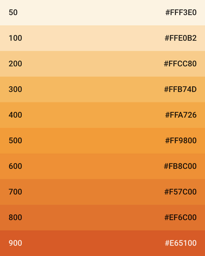
const boxh = height / 10;
for(let i = 0; i < 10; i++) {
  const h = lerp(64, 22, i / 9);
  const s = lerp(86, 90, i / 9);
  const l = lerp(96, 56, i / 9);
  fillHsluv(h, s, l);
  rect(0, i * boxh, width, boxh);
}
lerp() function in a loop.This chapter introduced techniques to help designers explore the color spectrum through the hue, saturation, and lightness dimensions of the HSL color model. Using these techniques, designers can move away from the 2D color solid known from the color picker, and approach color combination by focusing on the relationship between colors in a 3D space. Whether these techniques are used to quickly test different color combinations, or built directly into digital design products, they are another important tool for a designer wanting to treat design as a systematic art.
Exercise
Design a simple book cover for one of your favorite books. The design should use basic or custom shapes, but no typography. Once you have a design that conveys something in the storyline, consider which type of color scheme is needed to support your design. Keep in mind that a science fiction thriller might need very different colors than a romance novel. Then, color the shapes in your design using the techniques presented in this chapter. Rather than hard-coding the colors, try to make a design where the color scheme is different every time the sketch runs. The challenge is to make a dynamic color scheme with a consistent visual style.
- Gegenfurtner, Karl. R.; Sharpe, Lindsay. T. (2001) Color Vision: From Genes to Perception, p. 3-11. Cambridge University Press
- O'Connor, Zena (2010) Color Harmony Revisited, p. 267-273. Color Research and Application. Volume 35, Issue 4
- Gegenfurtner, Karl. R.; Sharpe, Lindsay. T. (2001) Color Vision: From Genes to Perception, p. 3-11. Cambridge University Press